Tuesday, July 2, 2013

Pennant Chart Pattern

In the post Chart Pattern: Pipe Top and Pipe Bottom is the pipe top and pipe bottom pattern illustrated; in the post is also links to other posts illustrating different chart patterns.

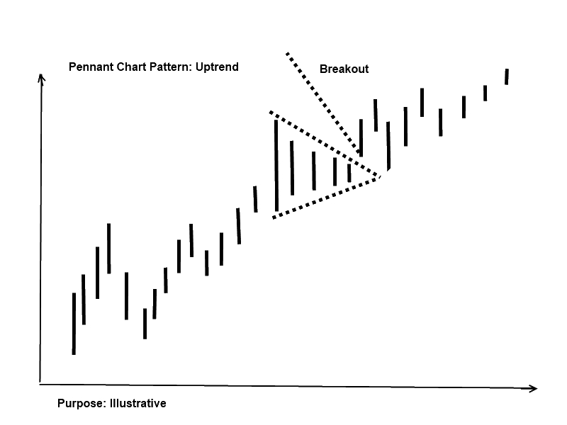
In this post is the pennant chart pattern illustrated; the pattern is a continuation pattern as it is a part of an already existing trend. The pennant pattern is a break in the already existing trend and looks like the triangle chart pattern.

Pennant Chart Pattern: downtrend
The image illustrates a downtrend; the trend is a pennant pattern and a breakout; it is often seen that the price returns to the breakout level and afterwards continues the trend.


Pennant Chart Pattern: Uptrend
The image illustrates an uptrend; in the trend is a pennant pattern and a breakout; it is also often seen that the price returns to the breakout level and afterwards continues the trend as described in the downtrend section.


Tuesday, June 25, 2013

Social Investment Network in your language

On eToro social Investment Network trading platform is the language in English; if you are from a different country like a German speaking country or Italy, Spain, France etc. and would like the trading platform in your own language watch the video from Etoro.

The video is in German but easy to understand as the changes in the language setting is well illustrated.  


Monday, June 24, 2013

Chart Pattern: Pipe Top and Pipe Bottom

In earlier posts I have written about chart pattern; the posts are


In this post is the pipe top and pipe bottom illustrated. It is a pattern that gives the traders an indication of in which direction the price is moving in.

Pipe top
The pip top pattern is a pattern that ends in a top and then starts to fall; the image illustrates a bullish trend; the pattern ends with two candlesticks; when the lowest of the two lows ends the price is expected to fall.


Pipe bottom
The pip bottom pattern is a pattern that ends in a bottom and then starts to rise; the image illustrates a bearish trend; the pattern ends with two candlesticks; when the highest of the two highs ends the price is expected to rise.
 
Note
In the post is the term bullish and bearish used; a bullish market is when the price is rising and a bearish market is when a price is falling.

In the post is also the term candlestick used; more information about what a candlestick is in the article “Trading Forex Online? What Is a Candlestick Chart and How to Read a Candlestick Chart?

Success Stories: Social Investment Network

In earlier posts I have written about social Investment network in this video from eToro are two success stories from the social trading platform; in the anchor text to the video is written “…in this short video we give you 2 examples who have experienced success by socializing their trading skills and communicating with all their copiers…..”


More information about eToro Social Investment network is on my website with links to the trading platform; click here and visit my website.

Tuesday, June 18, 2013

Forex Trading: Parabolic SAR Stop and Reverse Technical Indicator

An indicator on the trading platforms like PLUS500 is Parabolic SAR; it is an indicator that is useful in a trend-following market and best if the investment is a long term investment.

The Parabolic SAR indicator can not stand alone as a basis for a decision.

Parabolic SAR stands for stop and reverse as the indicator provide the traders with information about the trend direction; is the trend bearish is the indicator line above the price line and if the market is bullish is the indicator line below the price line.

The image illustrates the price line and the parabolic SAR indicator.


More about parabolic SAR

In the article is written that it is important testing the indicators to improve and find the right trading tools; just to make it easier to understand how a test could look like is a visualisation of a test in the table below.


More information on how to test a trading strategy is in the article Forex Online Trading? How To Test a ForexTrading Strategy.


Monday, June 17, 2013

Chart Pattern: Double Top and Double Bottom

In previous posts I have written about chart pattern; in this post is the double top and double bottom illustrated. The patterns are common patterns.

In general about pattern
Looking at the charts give the traders’ information in which direction the chart is moving in.

If the price increases to a level and falls to a lower level and start again to rise to a higher level; the trader expects the price to fall when the price reaches a certain level.

Reverse are the traders expecting the price to rise if the price level is falling to a certain level and rising to a higher level and falling to a certain level.

The traders have also information about how much they expect the price to fall and rise if the patterns are a described.

Double top
The double top pattern is when the price move’s from a lower point to a higher point and reverses to a lower point and starts to rise and fall as the image illustrates; the pattern is first ended when the price reaches point E.

The traders expect as a minimum the price will fall the difference between D and E as the image illustrates.    

Double bottom
The double bottom pattern is when the price move’s from a higher point to a lower point and reverses to a higher point and starts to fall and rise as the image illustrates; the pattern is first ended when the price reaches point E.

The traders expect as a minimum the price will increase the difference between D and E as the image illustrates.    


Thursday, June 13, 2013

What Is the Difference Between Fundamental and Technical Analysis?

In an earlier posts I have written about my article base; in this post is a link to the article “What Is the Difference Between Fundamental and Technical Analysis?”;

The article gives a short decription of the differnces between fundamental and technical analysis; the link to the article is here .


Wednesday, June 12, 2013

Chart Pattern: The Triangle Pattern

In earlier posts is the diamond chart pattern and the head and shoulder pattern illustrated; in this post is the illustration the triangle pattern.

The triangle pattern
The triangle pattern consists of a support and resistance line; between the two lines are the price line; the line is moving upwards and downwards in a pattern.

If the price development is a triangle pattern the price development will end in a triangle as the images show.

The triangle pattern has different looks depending on the price development.

The ascending triangle
The triangle is called ascending as the price development is rising; the resistance line is flat and the support line is upwards; if the price line is as illustrated the most likely breakout is an uptrend.

The descending triangle
The triangle is called descending as the price development is falling; the resistance line is downwards and the support line is flat; if the price line is as illustrated the most likely breakout is a downtrend.


The symmetrical triangle
The triangle is called symmetrical as the price development is getting symmetrical smaller; the resistance line is downwards and the support line is upwards; if the price line is as illustrated the most likely breakout is almost equal between an uptrend or a downtrend.  

Video illustrating the Triangle pattern
I was on YouTube and found a fellow explaining the Triangle pattern; he also gives some percents of how likely the breakout patterns are.


Friday, June 7, 2013

Chart Pattern: Diamond Bottom and Top Chart Pattern

Earlier I have written about the head and shoulder chart pattern in the post “Trading the Crown or trading head and shoulders

In this post is the Diamond chart pattern illustrated; the pattern consists of a diamond as the image illustrates and is divided into a bottom and a top chart pattern.

The diamond pattern could give the traders a hint in which direction the price is moving in as it seems like there is a pattern in which direction a breakout moves in after a diamond price movement; just remember that it is the most likely direction it is not sure the price moves in this direction.

Diamond Bottom and Top Chart Pattern

I was on YouTube and found a fellow explaining the diamond pattern; he also gives some percents of how likely the breakout patterns are.