Tuesday, September 10, 2013

Harmonic Trading: AB=CD Pattern

In the last post was the focus on the three drive pattern and harmonic trading. In this post is the focus on the AB=CD pattern.

AB=CD Pattern
In an AB=CD pattern is A-B = C-D; the time duration between A to C is the same as the time duration between B to D. 

The same time duration is in this context approximately the same time duration. An example is a 20 week time duration from A to C and 15 weeks time duration from B to D.  

AB=CD Pattern and the Fibonacci numbers
The AB=CD pattern is a pattern that indicates a trade opening with the Fibonacci numbers 0,618, 0,789, 1.27 and 1.618.

The calculating in the AB=CD pattern is
AB=CD
AB*1, 27=CD
AB*1, 618=CD

Illustration of the AB=CD pattern
In the image are a bullish and a bearish pattern illustrated

Bullish Pattern
The image illustrates a bullish AB=CD pattern with the Fibonacci numbers 0,618, 0,789 (AB) and the CD numbers 1,27 and 1,618.

A buy opening is likely if the price curve is in the harmonic area 0,618, 0,789, 1,27 and 1,618 at point A, B, C and D; the buy opening is likely as the AB=CD pattern indicate a rise in the price curve.

A stop loss should be a couple of pips below point D; remember that a stop loss is set individually and that the numbers are not exact numbers but numbers in an area; a harmonic area.

Bearish Pattern
The image illustrates a bearish AB=CD pattern with the Fibonacci numbers 0,618, 0,789 (AB) and the CD numbers 1,27 and 1,618.

D is a likely sell point if the price curve is in the harmonic area 0,618, 0,789, 1,27 and 1,618 at point A, B, C and D; the sell is likely as the AB=CD pattern indicate that the price curve decrease.

A stop loss should be a couple of pips above point D; remember that a stop loss is set individually and that the numbers are not exact numbers but numbers in an area; a harmonic area.

Calculating the AB=CD pattern in a spreadsheet
An example of how to calculate an AB=CD pattern in a spreadsheet is illustrated in the images below.

Spreadsheet; bullish AB=CD pattern


Spreadsheet; bearish AB=CD pattern


Conclusion
In this post is illustrated how an AB=CD pattern looks like and how a spreadsheet could look like calculating an AB=CD pattern.

The purpose in this post is illustrative and only the basic in the AB=CD pattern is illustrated as the Fibonacci numbers could be more extreme than the numbers used in this post. The numbers used in this post is the ideal numbers in an AB=CD pattern.

In some AB=CD patterns are the AB=CD pattern also in the main AB=CD pattern.

Friday, September 6, 2013

Harmonic Trading: Bullish and Bearish Three Drives

Harmonic trading is a trading technique recognizing a specific pattern with the Fibonacci ratios. The technique assumes the patterns repeat themselves.

Harmonic trading is to identify these patterns and to identify when to enter or exit a position based on the historic cycles in the patterns.

The patterns are not 100% accuracy in connection to the Fibonacci ratios but approximately to the numbers. The important is to recognize the pattern.

The technique is useful to any time frame.

The Fibonacci Numbers
Harmonic Trading is based on the Fibonacci ratios. The primary ratios are the numbers 0.618, 0.786, 1.27, 1.618 and the secondary numbers are 0.382, 0.50, 1.00, 2.0, 2.24, 2.618, 3.14.

The most used numbers are the primary numbers; the ratios 2.24, 2.618, 3.14 are considered as extreme numbers.

The ratios are used to identify the cycle in the historical pattern and to identify the entry point, exit point and stop loss.

The Three Drives
A three drive is a 3 wave pattern following the Fibonacci numbers. The pattern could be a bearish or a bullish pattern.

A Bearish Three Drives
The pattern is illustrated in the image

The image illustrates a three wave cycle; the impulse waves are the Fibonacci numbers 1,27 / 1,618 and the corrective waves are the 0,618 / 0,786. At the point (3) the pattern will end and the price curve will be bearish. Point (3) is the exit point.

Calculation - Fibonacci numbers 0,618 and 1,27
An example; the price is 40 and rise to 50; the pattern rise with the numbers 0,618 and 1,27; the calculation is

0 – 1 (corrective wave)
40 – 50 =  10 * 0,618 = 6,18
50 – 6,18 = 43,82

1 – 2 (impulse wave)
40 – 50 = 10 * 1,27 = 12,7
43,82 + 12,7 = 56,52

1 – 2 (corrective wave)
40 – 50 = 10 * 0,618 = 6,18
56,52 - 6,18 = 50,34

2 – 3 (impulse wave)
40 – 50 = 10 * 1,27 = 12,7
50,34 + 12,7 = 63,04

63,04 is the exit point if the Fibonacci numbers are 0,618 and 1,27.

A Bullish Three Drives
The pattern is illustrated in the image

The image illustrates a three wave cycle; the impulse waves are the Fibonacci numbers 1,27 / 1,618 and the corrective waves are the 0,618 / 0,786. The pattern will end at the point (3) and the price curve will be bullish. Point (3) is the stop loss point and the entry point.

Calculation - Fibonacci numbers 0,618 and 1,27
An example; the price is 50 and decrease to 40; the pattern decreases with the numbers 0,618 and 1,27; the calculation is

0 – 1 (corrective wave)
50 - 40 = 10 * 0,618 = 6,18
40 + 6,18 = 46,18

1 – 2 (impulse wave)
50 - 40 = 10 * 1,27 = 12,7
46,18 - 12,7 = 33,48

1 – 2 (corrective wave)
50 - 40 = 10 * 0,618 = 6,18
33,48 + 6,18 = 39,66

2 – 3 (impulse wave)
50 - 40 = 10 * 1,27 = 12,7
39,66 - 12,7 = 26.96

The entry point and stop loss are set at the price level 26,96 if the Fibonacci numbers are 0,618 and 1,27.

Thursday, August 15, 2013

Elliott Wave Theory: Triangle Pattern

In an earlier post and in one of my earlier articles is written about the triangle pattern and the Elliot waves. The post and the article are on the following links


Focus in this post and the Elliot wave theory 
In this post is the focus on the triangle pattern in an Elliot wave; the focus is also on possible entry in an Elliot wave with a triangle pattern. The article “Trading Forex Online? What Are Elliott Waves?” described the theory; just to make the theory more understandable is the theory illustrated in the images.

The impulse and corrective waves 
The first image illustrates the Elliot wave theory; the impulse and corrective waves; the image illustrates also the pattern in the waves. 
The corrective waves 
The corrective waves are on the first image placed as a correction just after the last impulse wave; wave number 5. On the image below is the corrective waves also placed between the impulse waves as an A, B and C pattern. 
In the image is the corrective pattern illustrated as an A, B, C pattern; the pattern is a “zigzag” pattern but could also have been a “flat pattern” or both; a “zigzag” and “flat pattern” as in a triangle pattern.

The Elliott waves and the triangle pattern 
A triangle pattern is an A, B, C, D and E pattern that ends with a breakout; in the image is the triangle pattern between the 3 and 4 impulse waves; a good place to enter a trade as the impulse wave; number 5; isn’t the shortest of the 5 impulse waves.

 If the price develops as the theory describe an entry is made at E4. 

Friday, July 19, 2013

Investing in Currency Pairs: The Bollinger Bands and the Stochastic Oscillator

In earlier posts are the Bollinger band and the stochastic Oscillator used to analyze the market for entries. In this post is the Bollinger bands and the stochastic Oscillator illustrated.

The Bollinger bands and the stochastic Oscillator
The Bollinger bands consist of an upper band and a lower band; if the price line is outside the upper band is it an indication that the currency is oversold; if the price line is outside the lower band is it an indication that the currency pair is overbought.

The indicator cannot stand alone; as a second indicator is the stochastic Oscillator handy as it provides information about the market condition; is the market in an oversold or overbought condition.

The Bollinger bands
The image illustrates a price line and the Bollinger bands; the volatility in the market rise with the bands; wider bands are a market with more volatility and reverse.

If the price rise and the lower band starts to fall is it an indication that the price will start rise slower or fall; if the lower band starts to rise is it an indication that the price will start to rise faster.

The stochastic Oscillator
The image illustrates also the stochastic Oscillator; in this post is it the second indicator; it confirms the market condition the Bollinger bands provide.

How to use the two indicators 
The indicators are used to find the entry and exit point where the market is in an oversold or overbought condition; in my article “Trading Forex Online - How to Use Bolling Bands and Stochastic Oscillator As a Trading Strategy” are described how to trade with the two indicators.

In the image is an overbought and an oversold situation;  the two indicators give the traders an indication of which direction the market is moving in by looking at the tops and bottoms of the price line and the tops and bottoms of the Stochastic Oscillator.

In the overbought situation is the two highest price line tops in an uptrend and the two price line tops at the Stochastic Oscillator in a downtrend which indicates an exit point if the items are met in my article “Trading Forex Online - How to Use Bolling Bands and Stochastic Oscillator As a Trading Strategy” .

Reverse in the oversold situation is the two lowest price line tops in a downtrend and the two price line bottoms at the Stochastic Oscillator in an uptrend which indicates an entry point if the items are met in my article “Trading Forex Online - How to Use Bolling Bands and Stochastic Oscillator As a Trading Strategy”.

Please note that the past performance of any trading system or methodology is not necessarily indicative of future results which also is the case using the two described indicators.

Friday, July 5, 2013

Trading Forex Online: Is it a Good Idea Using a Demo Account?

Trading CFD in Forex, stocks, indices, ETFS and commodities can be beneficial and generate a larger profit but is also a market that generates losses.

As the market is a market with risk and the possibility losing money a demo account might be a good idea. But what are the advantages and disadvantages using a demo account?

A demo account is a part of the real trading account; it has the same instruments as a real account and the currency rates are the live currency rates. The advantages using a demo account is that there are no risks as the money are virtual money and the cost using the account is zero. The disadvantage is that the profit generated is also virtual money.

Another advantage is the possibility to try different trading strategies and learn how the platform works in connection to the plan; an example of a trading plan is the use of indicators such as the use of the Bollinger bands and the stochastic indicators; another example is the use of moving average and the MACD indicator.

One of the disadvantages is the risk; on the practice account is the risk zero and the money is virtual money and the money amount is large; in a real trading situation is the money real and the money amount limited; it is not possible to trade unlimited trades on the real account as it is on the practice account.

On the internet is a lot of articles about advantages and disadvantages using a demo account and they argue that it is a disadvantage using the practice account as the feeling using virtual money is not the same as using real money; this is true also in connection to the money limitation on the real account; but with the demo account is it possible to trade with lager amount and get the feeling of how it is to trade with larger amounts; the feeling of losing 1 dollar is not same as the feeling of losing 10 dollar on each pips.

Some trading platforms have a bonus or a gift card for signing up at their trading platform; if you have the interest trying different trading platforms with real money is the social trading platform eToro a possibility as they at the moment is giving away a free 20 dollar coupon; another trading platform is PLUS500 they give away a bonus for signing up; at the moment is the bonus 25 Euro.

Please notice that your capital may be at risk trading CFD.

Tuesday, July 2, 2013

Pennant Chart Pattern

In the post Chart Pattern: Pipe Top and Pipe Bottom is the pipe top and pipe bottom pattern illustrated; in the post is also links to other posts illustrating different chart patterns.

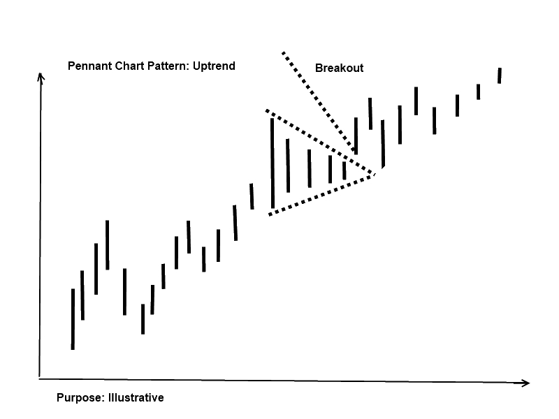
In this post is the pennant chart pattern illustrated; the pattern is a continuation pattern as it is a part of an already existing trend. The pennant pattern is a break in the already existing trend and looks like the triangle chart pattern.

Pennant Chart Pattern: downtrend
The image illustrates a downtrend; the trend is a pennant pattern and a breakout; it is often seen that the price returns to the breakout level and afterwards continues the trend.


Pennant Chart Pattern: Uptrend
The image illustrates an uptrend; in the trend is a pennant pattern and a breakout; it is also often seen that the price returns to the breakout level and afterwards continues the trend as described in the downtrend section.


Tuesday, June 25, 2013

Social Investment Network in your language

On eToro social Investment Network trading platform is the language in English; if you are from a different country like a German speaking country or Italy, Spain, France etc. and would like the trading platform in your own language watch the video from Etoro.

The video is in German but easy to understand as the changes in the language setting is well illustrated.  


Monday, June 24, 2013

Chart Pattern: Pipe Top and Pipe Bottom

In earlier posts I have written about chart pattern; the posts are


In this post is the pipe top and pipe bottom illustrated. It is a pattern that gives the traders an indication of in which direction the price is moving in.

Pipe top
The pip top pattern is a pattern that ends in a top and then starts to fall; the image illustrates a bullish trend; the pattern ends with two candlesticks; when the lowest of the two lows ends the price is expected to fall.


Pipe bottom
The pip bottom pattern is a pattern that ends in a bottom and then starts to rise; the image illustrates a bearish trend; the pattern ends with two candlesticks; when the highest of the two highs ends the price is expected to rise.
 
Note
In the post is the term bullish and bearish used; a bullish market is when the price is rising and a bearish market is when a price is falling.

In the post is also the term candlestick used; more information about what a candlestick is in the article “Trading Forex Online? What Is a Candlestick Chart and How to Read a Candlestick Chart?

Success Stories: Social Investment Network

In earlier posts I have written about social Investment network in this video from eToro are two success stories from the social trading platform; in the anchor text to the video is written “…in this short video we give you 2 examples who have experienced success by socializing their trading skills and communicating with all their copiers…..”


More information about eToro Social Investment network is on my website with links to the trading platform; click here and visit my website.